The review didn't take long but it formalised the areas where improvement could be made to the product and helped me create a UX debt backlog to prioritise.
During the review the normal surface-level checks were completed:
- Heuristic evaluation
- Accessibility study
- Visual/Brand cohesion review
- Front-end architecture analysis
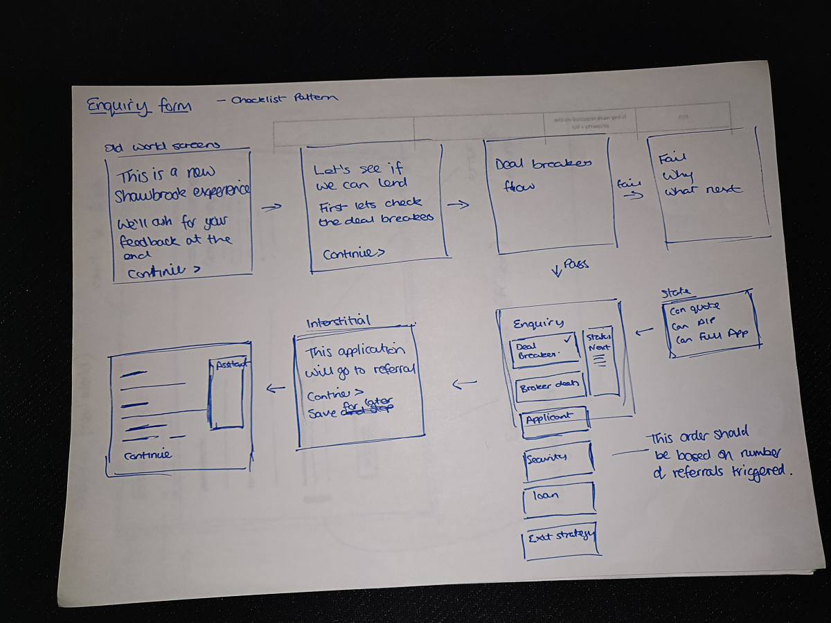
I found that the site used different design patterns to solve similar or the same problems as it had evolved.
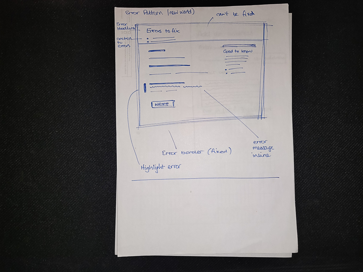
Accessibility was certainly an issue, for example; a lack of ARIA labels attached to AJAX events, random form element ordering, bad colour contrast ratios and tiny text.
Out of date visual treatments, that were out of step with the brand guidelines currently being used on the brochureware sites.
A dated front-end architecture that had not been maintained, including out of date javascript libraries.