Shawbrook Bank offers commercial mortgages to intermediaries. You could sometimes get an Application in Principle (AIP) but the rest of the way was paper-based.
About
Their specialist loans needed specialist underwriting, no solution on the market was fit for purpose.
I led the research and design while supporting the business change through workshop facilitation and sharing design thinking methods.
Internal information gathering
Before I went to meet the end-users I learnt as much as I could about Shawbrook's commercial lending.
We were lucky enough to have not one but two subject matter experts (SMEs) with us through the journey. Every day we would have systems demonstrated and questions answered.
It was important to get a basic understanding of the Bank before we approached their Brokers. We knew how much broker relationships meant to the bank, so we ensured we treated them delicately.

Expert review
The review didn't take long but it formalised the areas where improvement could be made to the product and helped me create a UX debt backlog to prioritise.
During the review the normal surface-level checks were completed:
- Heuristic evaluation
- Accessibility study
- Visual/Brand cohesion review
- Front-end architecture analysis
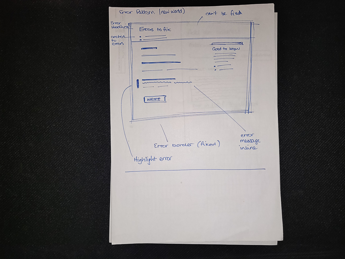
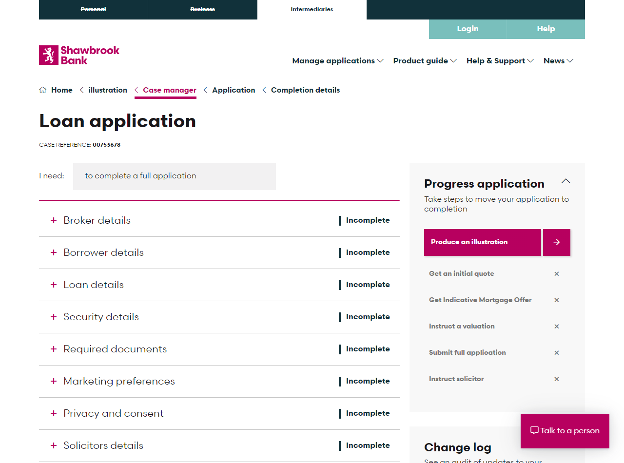
I found that the site used different design patterns to solve similar or the same problems as it had evolved.
Accessibility was certainly an issue, for example; a lack of ARIA labels attached to AJAX events, random form element ordering, bad colour contrast ratios and tiny text.
Out of date visual treatments, that were out of step with the brand guidelines currently being used on the brochureware sites.
A dated front-end architecture that had not been maintained, including out of date javascript libraries.
Interviewing Brokers
Accompanied by our Business Analyst (BA) we travelled around parts of the UK meeting Brokers, Packagers and Introducers. We utilised their existing relationships with Business Development Managers (BDMs) to score the meetings in the first instance.
During the interviews, I used the customer development interview technique to ask Brokers about the last time they used Shawbrook to apply for a loan on behalf of a borrower.
We got them to tell a story to understand the job the borrower was trying to hire Shawbrook to do. I would continue to use the five whys method to extract the underlying cause and effect of the pains users have in their pursuit of progress.
The business already had a priority backlog and I wanted to juxtapose that against the brokers own backlogs. I used the monopoly prioritisation technique to force brokers to prioritise their needs in a way that was engaging and thought-provoking.
Persona generation
Output from our interviews generated 3 key Broker personas based upon attitudes, expertise and clout with the bank:
- New Networkers
- Bespoke Brokers
- Volume Brokers
National coverage
We met 20 Brokers from Essex, Suffolk, Kent, London, East Midlands and Merseyside. We found regional differences in sentiment and activities pertinent to how Shawbrook operated across the UK.
Hi-fidelity user interfaces
In this project, it was necessary to open up UXpin and develop some high fidelity UIs. This allowed me to explore the visual treatments for, at the time, undefined patterns.
When to use Hi-Fi mockups
In situations where a design system is already well documented I tend to only lean on hi-fi UI design when there's a new pattern or page layout to define.
Prototypes
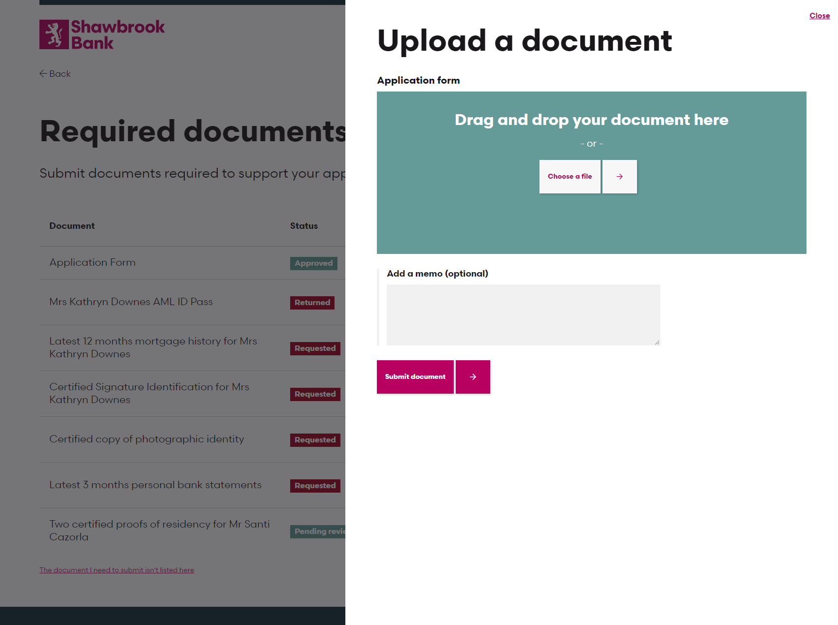
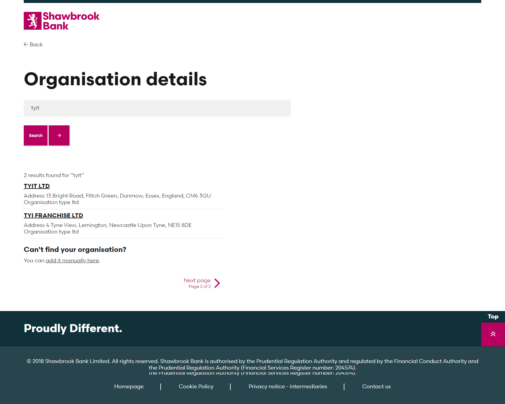
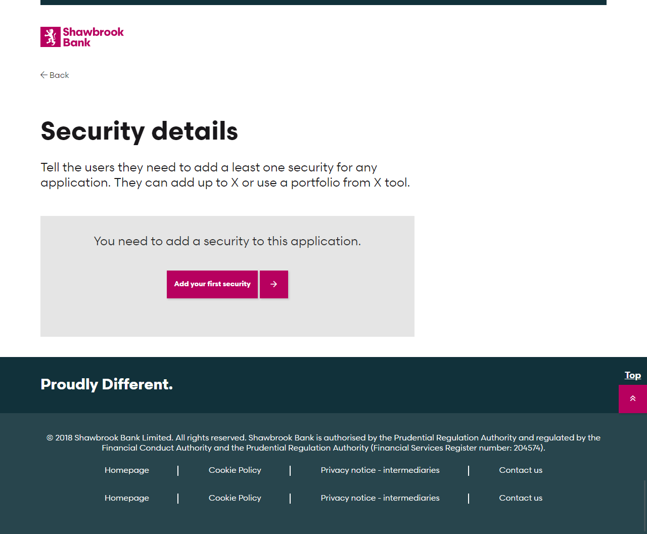
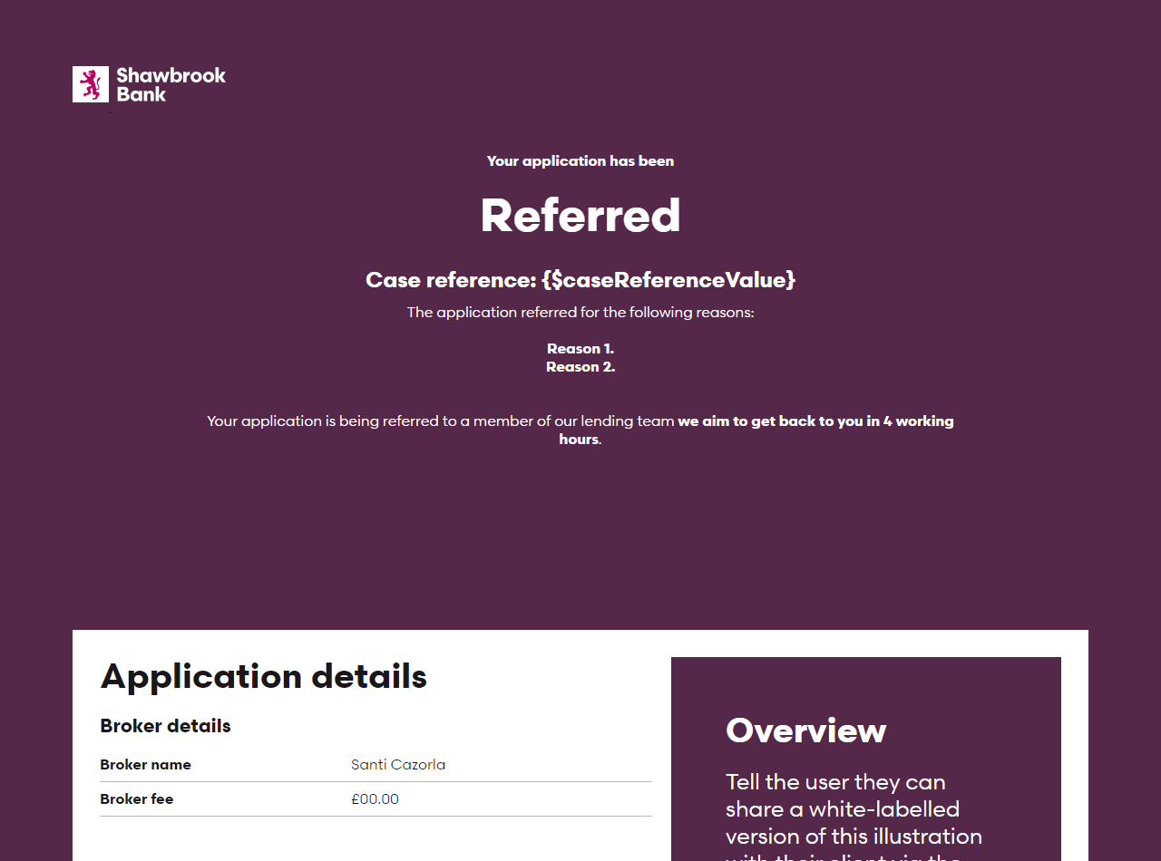
By employing a HTML/SASS/JS (jQuery) I was able to build rich data prototypes that are as close to the real experience as possible. While they take longer to build initially, once you begin to iterate on the prototype you end up with a toolkit that allows you to quickly spin up new pages and journeys.
MVP
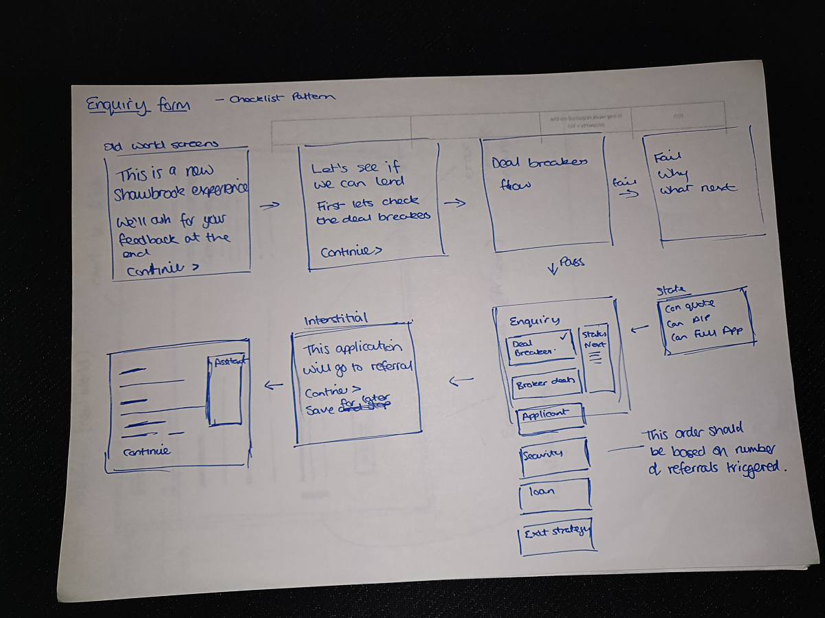
The MVP was a stripped back version of the vision piece. It reduced the scope down to the smallest thing we could build that would deliver value to the Broker and help us learn their user needs.
React front-end
We built our new application from the ground up utilising React to create pages with lightning response and rendering times.
Mobile-first
We had no mobile users because our mobile experience was broken. Our adopted design system was responsive by default so it opened up the opportunity to serve a new user base.
Helpful content
Sometimes it's hard to avoid help content. For example, our MVP only supported 1 product type. We used an accessible pop-over micro-interaction to explain this to those who were curious or confused.
Single-column UI
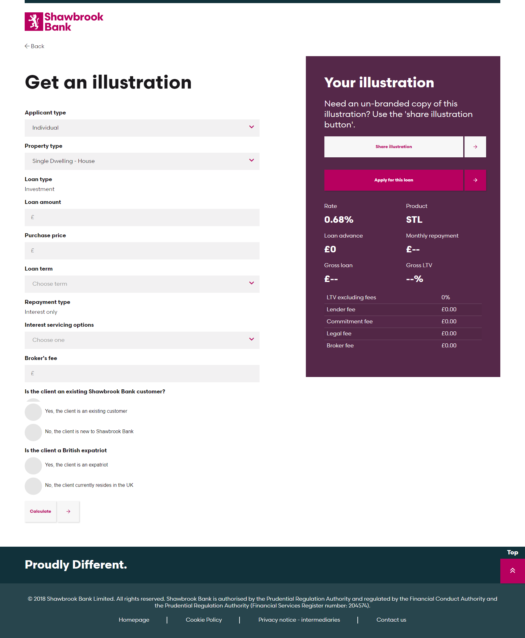
The single-column UI was a step-change from the multi-column layout employed by the previous design. It made the form much easier to scan reducing the chances a user would miss an input field, something we noticed even with our experienced test users.
Reflection
The prototype set the vision, our key stakeholders had this tangible demo they could interact with, talk around and show to others. We used it as a tool to get buy-in from the business and validation from the users.
We released our MVP without fanfare to our early adopters, users who were looking to make progress even if it meant a little pain along the way.
Early data shows a modest move towards faster applications, the more promising feedback has been qualitative. Brokers are reaching out to comment on how they 'love' the new 'straight forward' application and are looking forward to seeing more products (financial) being made in the same way.

