
The popemenu story started with a bunch of friends, passionate about discovering food…
The original concept
popmenu was supposed to be Instagram for food, where people would share their experiences online. Like FOODit, the framing around the individual dish over the restaurant to cuisine took precedence. Users would search their area or 'pop' items they enjoyed sharing with others. While the idea was popular among the team a business model needed to support it.
Early ideation
Early prototypes focussed on enhancing the consumer experience. It was quickly discovered that creating a best in class experience wouldn't be possible without first cracking the menu problem.
Taste profiling
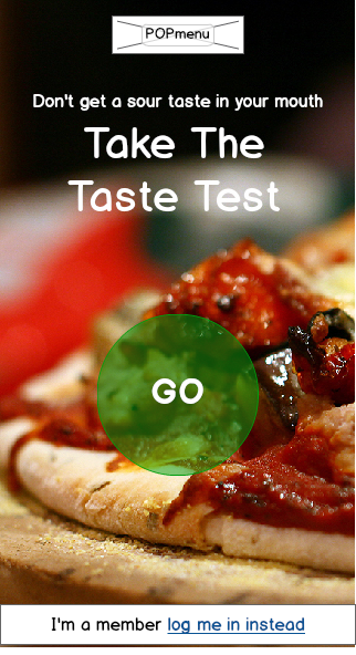
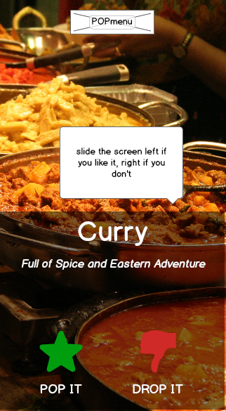
I developed a design pattern along with a data model designed to kickstart a recommendation engine for users. Users who indicated they liked, for example, curry would increase their data points around spice and viscosity.
Users found this more engaging than a form and after several swipes, we collected lots more weighted data than a form could hope to achieve.
User Groups
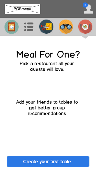
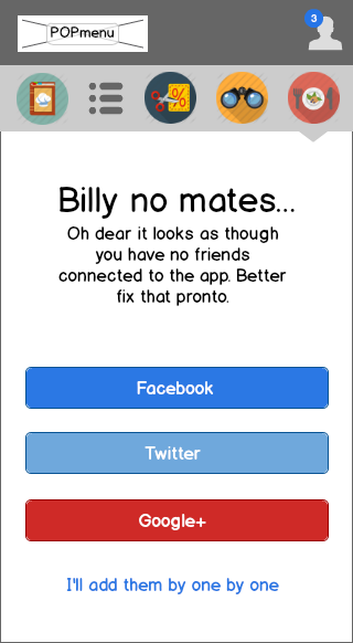
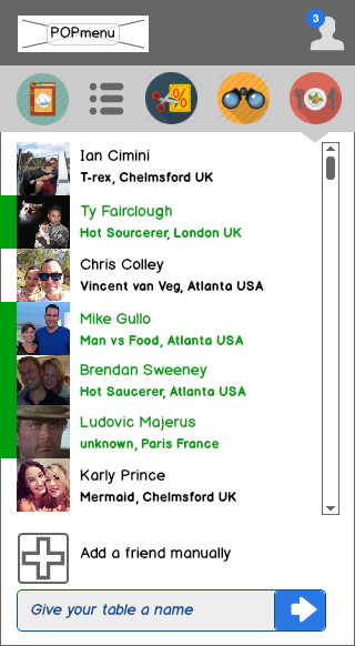
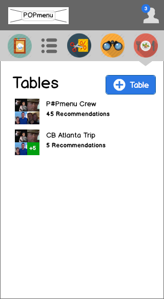
The app concept allowed WhatsApp style groups to form that could in turn share taste profiles and other food-centric data as well as poll locations.
Once a group decides upon a restaurant the reservation details would be shared through the app and bill splitting features would also become more seamless as party members would already be made available to the POS through an API.
Too busy pounding yam
Without digital menus there were no dishes, without dishes, nobody could 'pop', the foodie app dream was in tatters.
During one pitch a restaurant manager was too busy pounding yam in time for service to even sit down with our rep. They hated Yelp's aggressive monetization of their data which didn't necessarily lead to more people through the door. They wanted a way to claw back their customers, but they didn't have the time.
Fighting for the little guys
Attention is the currency of the web and Yelp, GrubHub and UberEats have all the attention.
They use that dominance to charge huge commissions and fees to bring customers to the restaurants.
Until now restaurants haven't been equipped to break free from the oligarchs of food tech.
Hi-fo mockups
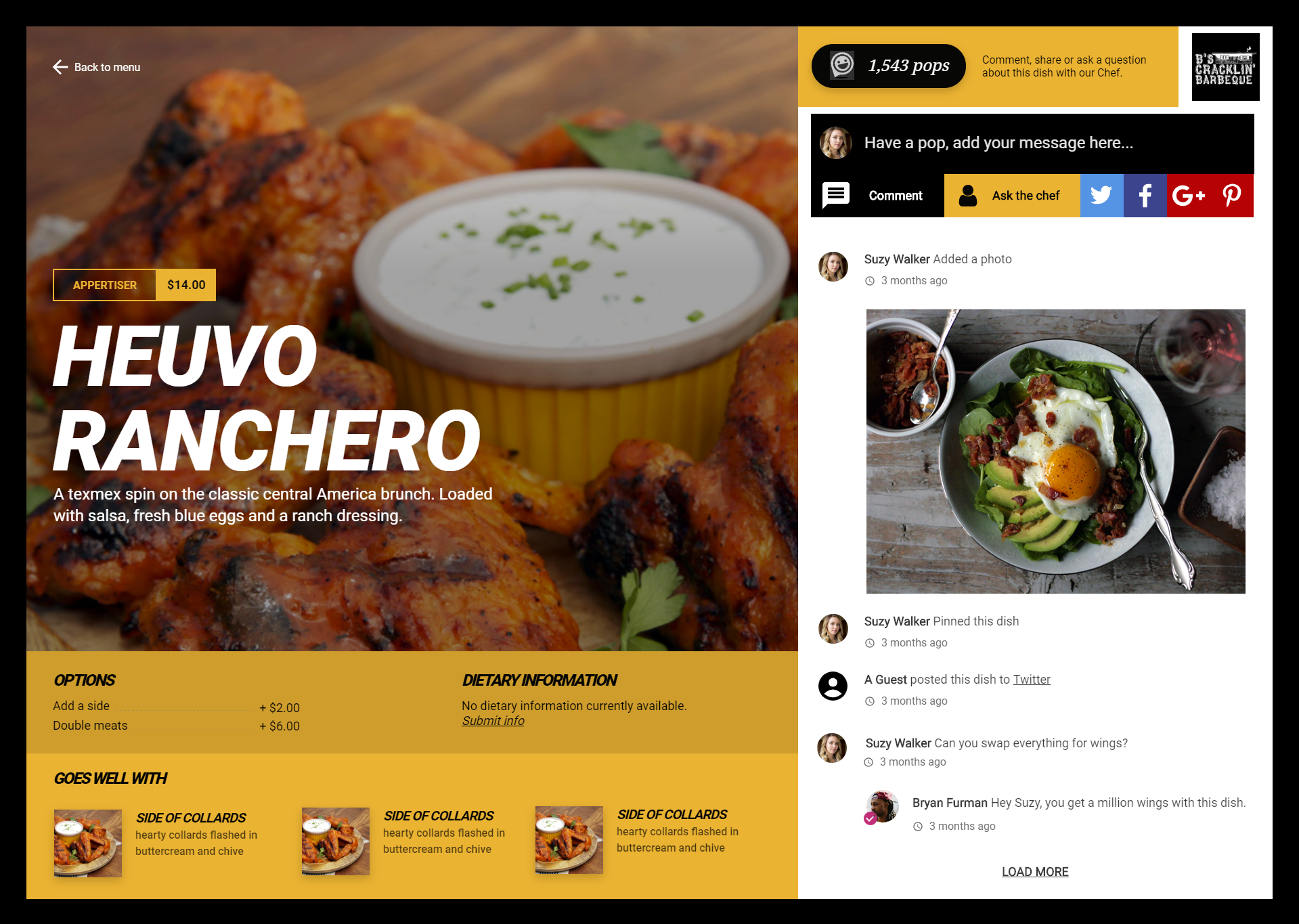
A restaurant's aesthetic is a core part of the dining experience. Full-service restaurant owners, in particular, demand websites are on-brand.
Hosted menus
popmenu's dynamic menus are at the heart of its remarketing engine. The website menu is one of the most visible deployments of that patented technology.
Automated promotion
POPMENU will take dishes and automatically create engaging posts and publish those to the main social networks.
Remind me to try it
The "Remind me to try it" feature allows guests to fulfil the urge to create lists and master them. The restaurant also develops a quantitative picture of interest in dishes.
Quality photography
Testing with users we saw many wouldn't interact without images for the dishes. All sales of popmenu come with discount professional photoshoots.
Word of mouth
'Popping' dishes is the digital equivalent of word of mouth promotion. Users who 'pop' dishes let their peers know they highly rate the dish.
Discovering user behaviour
We had a collection of hypothesis about how users would engage with the platform and one of the strongest signals we didn't anticipate was the time our sites were accessed.
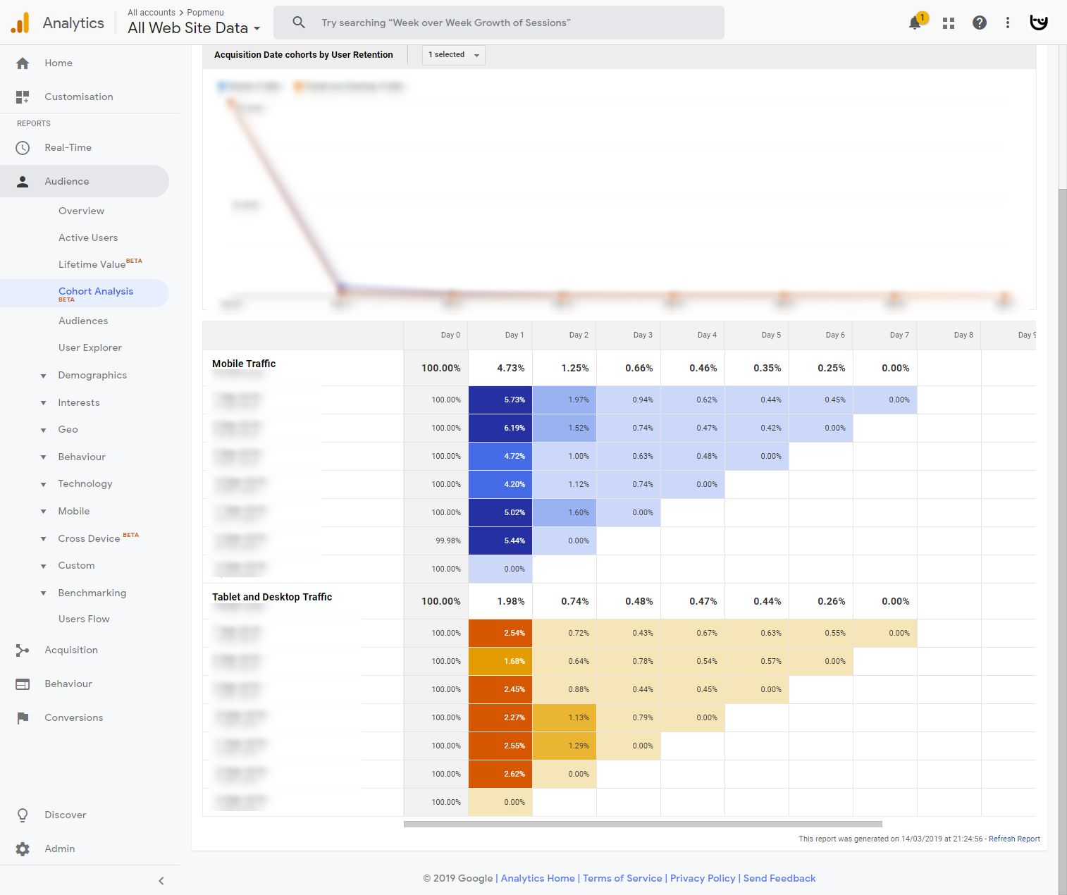
Looking at our analytics we learned that while desktop did spend longer on a page, it wasn't by anywhere near as much as we predicted. The theory of users carefully researching menus before a visit failed and a new hypothesis was developed.
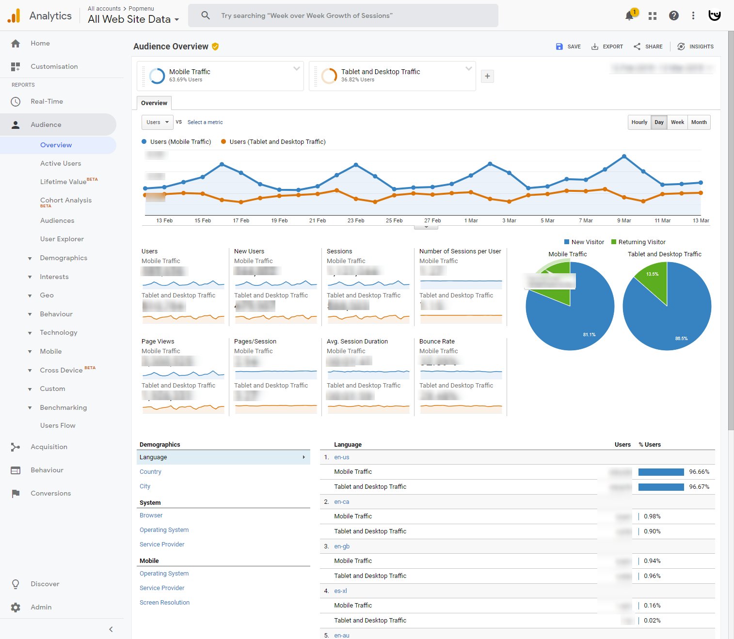
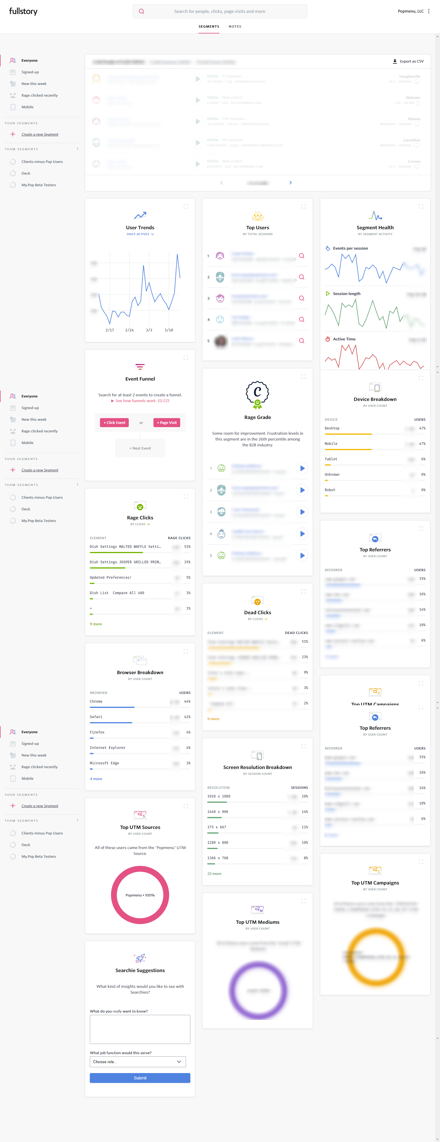
We also saw mobile traffic spike Friday to Sunday, quickly dropping off after 8 pm. We used Full story to unearth some of the behaviours and we discovered users were often looking for walk-in restaurants they were nearby. We developed some small tests to validate our rationale.
We also saw users spending more time, as expected, on items with photos. We launched a photo service for restaurants that were lacking quality images using this evidence and other data to demonstrate the need to restaurant owners. To this day menus with photos outperform those without in all our measures - they're a big deal.
